our brand
The Pi Beta Phi brand and corresponding communications are how the organization presents itself to the world, illustrating who we are and what we value. Our brand reflects our mission, vision and values.
The Pi Beta Phi brand and corresponding communications are how the organization presents itself to the world, illustrating who we are and what we value. Our brand reflects our mission, vision and values.
Today’s Pi Beta Phi is likely to show her individuality and pride in Pi Phi with a shirt, sweatshirt or jacket adorned with Greek letters. The combinations of colors, stitching and fabric are seemingly endless.
When Pi Beta Phi was founded in 1867, it is safe to say there was nowhere for the Ffounders to purchase sportswear with the organization’s name on it. More than a half of century would pass before Pi Beta Phi-branded sportswear would even be an option for members.
However, the early members did have a chance to be creative with several items including jewelry and stationery. Pi Beta Phi’s official jeweler was not chosen until 1913 when the Lloyd G. Balfour Company was designated. Prior to that, members were able to order arrow badges from any number of jewelers. The 12 Founders ordered their badges from Wilson Lusk in Monmouth. The members of Iowa Alpha ordered theirs from Hervey Crane in Mount Pleasant, Iowa. Those early I.C. arrows varied from chapter to chapter depending on which jeweler was used.
Chapters were also free to order stationery from any stationer of their choice, and the options in letterheads were limited only to the creativity of the designer at hand.
The first mass produced clothing items in the archives are two small square scarves. In the days before licensing, a company produced these items using the letters and badges of several women’s fraternities. They were sold in department stores, along with other scarves for other women’s fraternities and sororities in the 1940s. These Pi Phi scarves were gold and brown, rather than the current wine and silver blue.
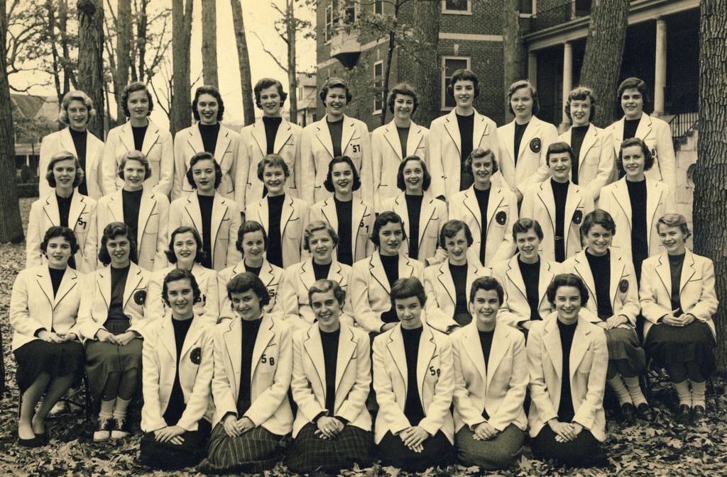
 In the 1940s and 1950s, blazers, usually white, with the Fraternity crest can be seen in composite pictures. Strict dress codes kept women from wearing slacks and sportswear for anything but recreational activities. Chapter members might have one sweatshirt, usually with a crest and/or the words “Pi Beta Phi” spelled out on the front. Members might wear these during “hours,” when the chapter members were required to be in chapter houses or residence halls. A few pictures show the women wearing sweatshirts during powder puff football games or other sports competitions.
In the 1960s, as dress codes went by the wayside and blue jeans became a part of college life, silkscreened and appliqued T-shirts became available. Campuses with a large fraternity system might have a store or two near campus from which to purchase Greek-letter clothing. Traveling sportswear salesmen would also visit chapter houses once a semester to take orders. Ordered clothes would arrive in the mail a few weeks later.
Satin Greek letters stitched on sweatshirts became popular in the 1970s. Patterned applique letters with contrasting stitching were the most popular the next decade, as were sweatpants with large Greek letters on the back. Unique, make-your-own apparel started to become available to members then with iron-on Greek letters.
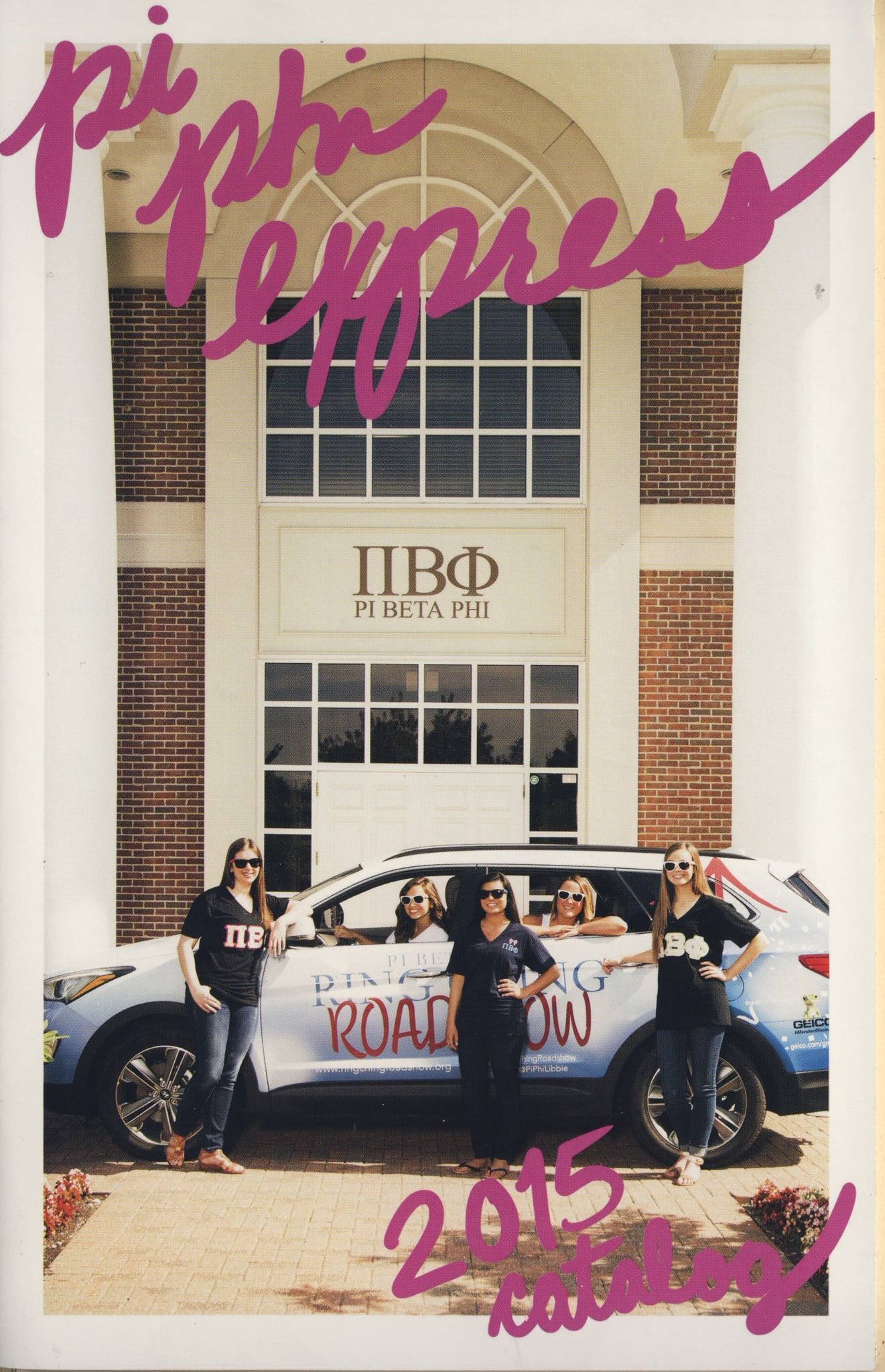
Pi Phi Express® began, in 1990, as a way for members to purchase Pi Phi items from Pi Beta Phi. Its establishment was concurrent with the initiative to make sure all products bearing the words and letters of Pi Beta Phi were fully licensed. Commercial use of trademarks on logo apparel and merchandise must be administered through a licensing agreement with Pi Beta Phi. One of the first catalogue for Pi Phi Express featured a puffy paint T-shirt, and the 1995 catalog had crewneck sweatshirts.
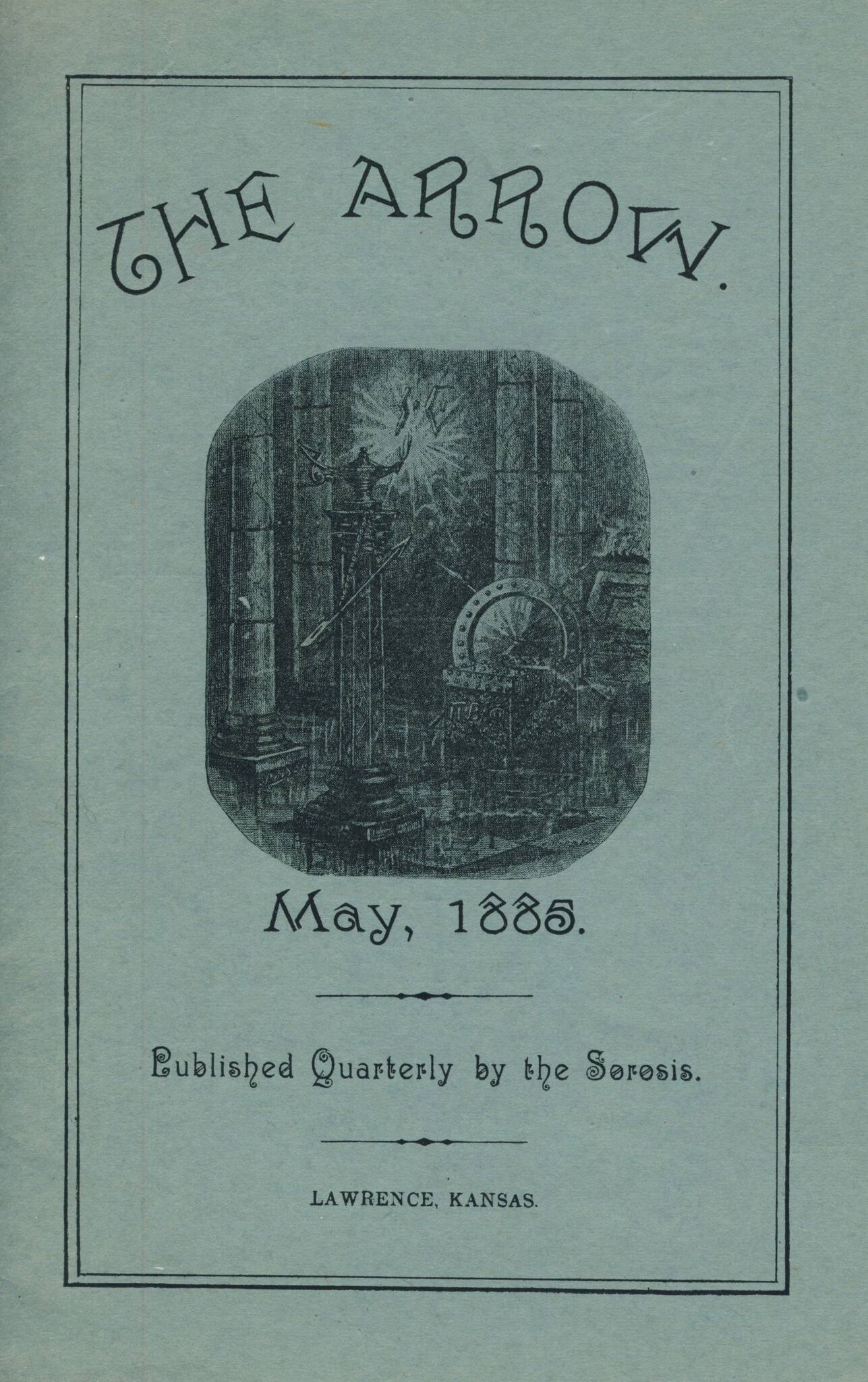
The Spring 1990 edition of The Arrow shared the news of the establishment of Pi Phi Express. “This exciting new merchandising program, featuring Pi Phi sportswear, gifts and novelties, will open in the spring/summer of 1990. Watch for the merchandising catalog.” The tagline was “Think Pi Phi – Shop Pi Phi.” Today Pi Phi Express offers a full line of merchandise and it operates out of Pi Beta Phi Headquarters in Town and Country, Missouri.
The Fraternity's magazine, The Arrow, has been a major part of Pi Beta Phi’s marketing and branding since its conception, although "marketing and branding" had yet to be identified as field of endeavor. The Arrow was created to share the Pi Phi experience with other chapters and other Greek-letter organizations.
 The first issues were more like a literary magazine than a fraternity magazine, although the first issue contained news of the 1884 Convention in Iowa City as well as a history of the Kappa Chapter (Kansas Alpha), the chapter responsible for the publication of The Arrow. The general themes of The Arrow have remained consistent, with a focus on celebrating the successes of the women in the Fraternity, highlighting acts of sisterhood and core values and sharing information from chapters and alumnae clubs.
The first pictures of chapter members appeared at the turn of the century, and as chapters were chartered, the installation festivities were reported to the membership. Early issues featured lengthy obituaries of members, alumnae personals for every chapter noting address changes, marriages and the arrival of children. The Arrow was sent to other Greek-letter organizations and there was an "Exchanges" section where the activities of the other organizations were reported and commented upon. The Fraternity Officer Directory has been a part of The Arrow since its inception; until the advent of the website, it was published in every issue and included the name of a contact with each chapter and alumnae club.
Between 1910 and 1920, The Arrow had a regular article titled “What A Fraternity Girl Thinks,” in which the writer chose a topic to discuss, like the importance of women and suffrage. There were updates on alumnae clubs, chapter updates, interest stories, a Fraternity Officer Directory, upcoming events, songs, poems and “College Honors.” While these general trends have remained since the beginning, the look and the stories have changed throughout the decades. Each Editor had a hand in shaping the magazine.
At the 2003 Anaheim Convention a new look for The Arrow was unveiled. The Fall 2003 issue was the first to highlight this new design. The masthead featured a swoosh design element and the pages were reformatted to include more color pictures and larger images. A revision to this design was made and reveled in the Fall 2007 issue. Additions included incorporating the swoosh element throughout the magazine headers and new reoccurring departments like Literacy, In Her Words and Remember.
Knowing how important The Arrow is to our members, and with the goal of making sure the magazine remains just as relevant for generations to come, The Arrow team set out to redesign the magazine in 2016. While the magazine was not broken, it had not been redesigned in almost 10 years. The magazine was beginning to look a bit dated, and we were constrained by some of the current design elements. As we continue to grow as a Fraternity, it’s important we evolve our communications channels as well. We wanted to ensure our magazine content, look and personality help us achieve our vision of being a premier organization for women. The changes included updates to both content and design, including a new masthead, expanded Collegiate News and Alumnae News sections and the addition of a new section “One, Two, Three Words” to cover Fraternity news, National Panhellenic Conference news, upcoming events and other newsworthy tidbits.
The Arrow continues to be a premier way in which Pi Phis around the world connect and serves as an archive of the history, growth and success of the Fraternity.
 2003 Rebrand and 150th anniversary
 At the 2003 Anaheim Convention, the Fraternity logo, as it is known today, was launched. It was created to bring together the elements of Pi Phi's heritage and augment that with a sense of positive forward motion. The modern font and upward design of the arrow are specifically utilized to illustrate those elements. The logo, which is used on all printed material, is designed to bring a forward-thinking contemporary look and feel to the graphics. All brochures and letterhead were updated to incorporate this new logo and also included new swoosh and arrow design elements. For Pi Phi's 150th Anniversary celebration, confetti and the tagline “celebrating 150 years” were added to the main logo.